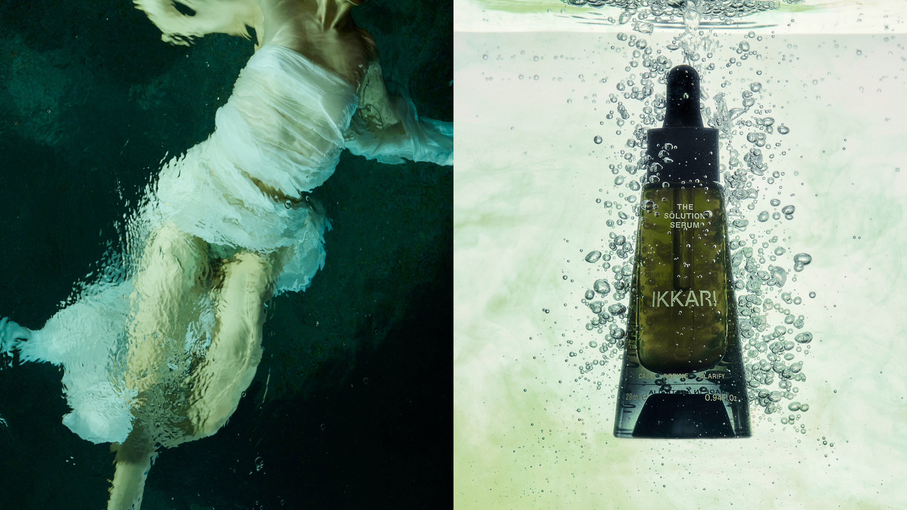
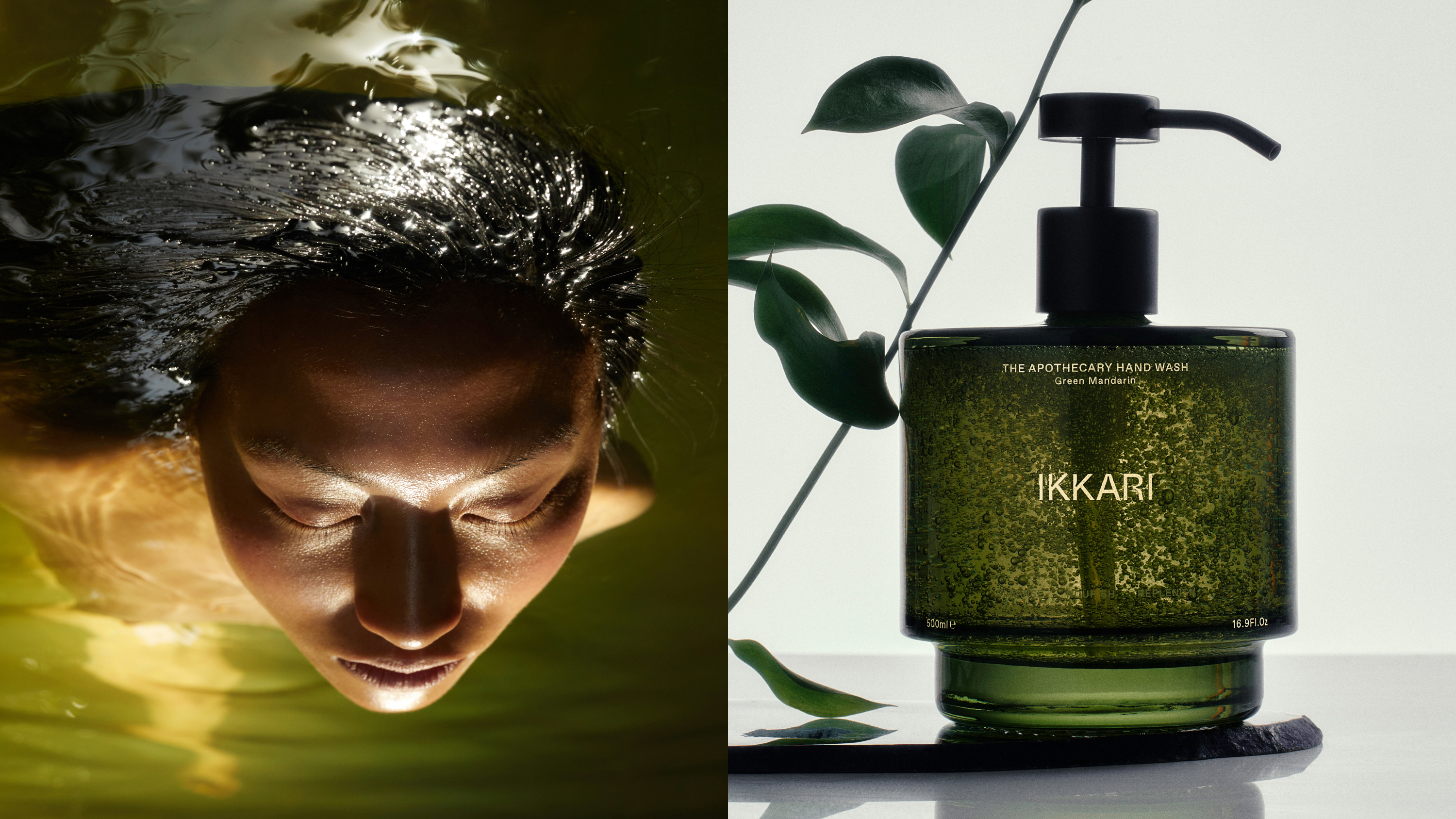
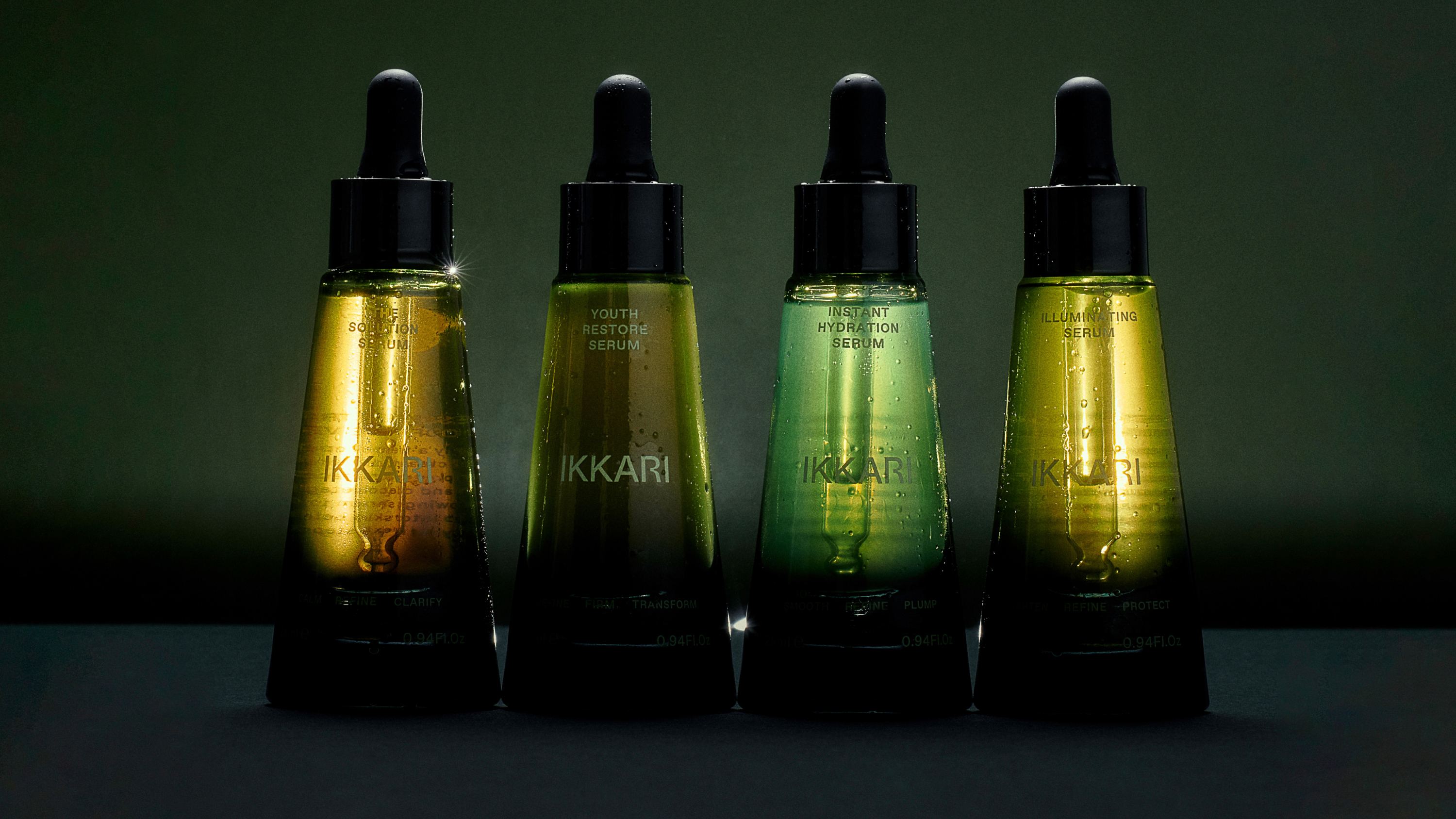
IKKARI
︎︎︎ Motion Design
︎︎︎ Case Study
“Inspired by the island of Ikaria in the Aegean sea – a certified Blue Zone where one in three people live into their nineties, IKKARI is a modern-day apothecary designed to offer curated, holistic and natural solutions to optimise health and wellbeing through the symbiotic relationship between what you put in and on your body.”
“IKKARI’s fundamental truth brings the idea that true wellness is a result of an interconnected set of conditions that cannot be achieved through any single method, treatment or product. The approach to methodologies, and structure of product ranges is split into three core categories: INNER, OUTER and AURA.”
My involvement in the project was finalising the motion design for IKKARI to use on their website/social media as well as the overall curation of the case study on the Made Thought website.
Made Thought (2023)
3D Design: Laura Cooper
Photography ©IKKARI
835453
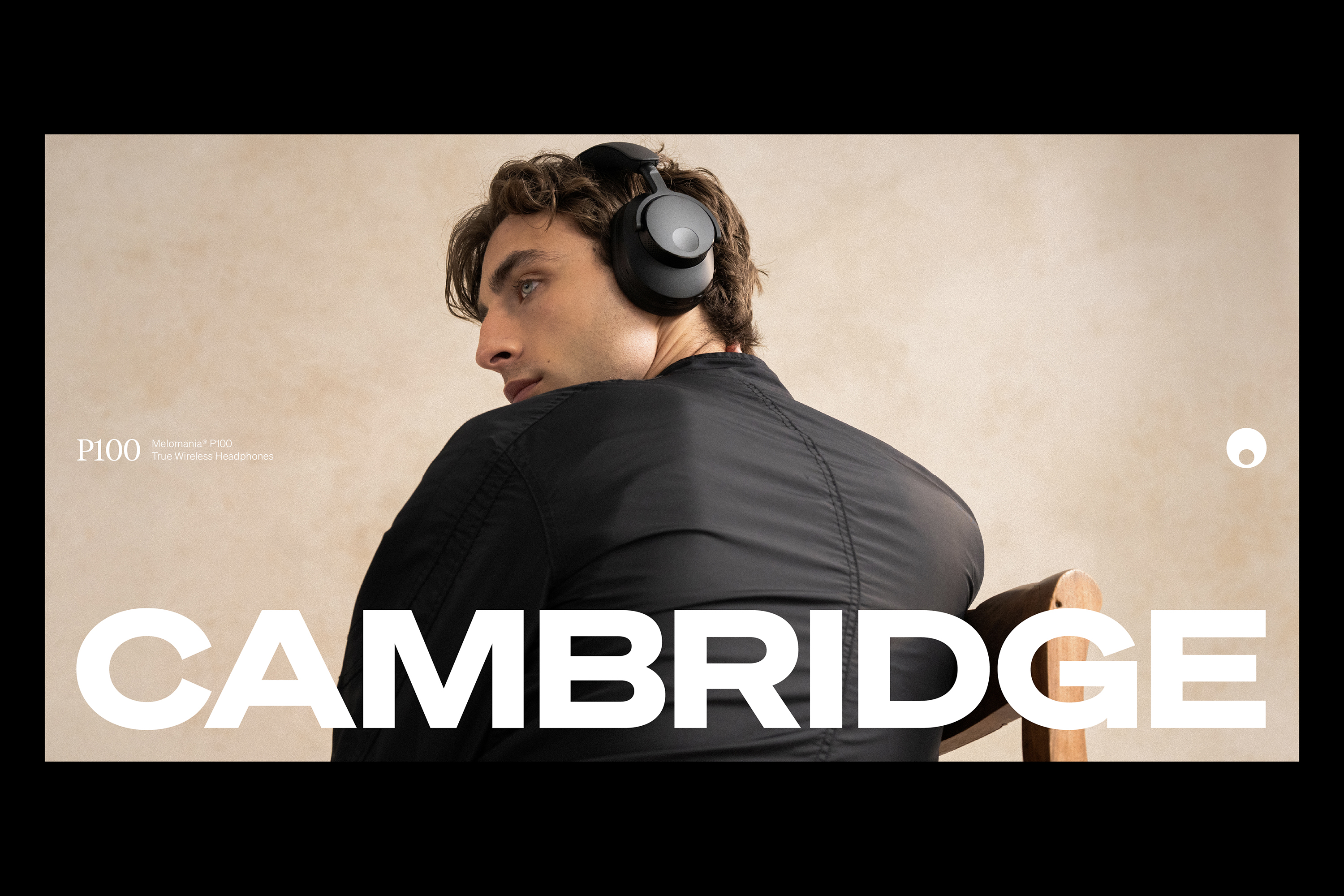
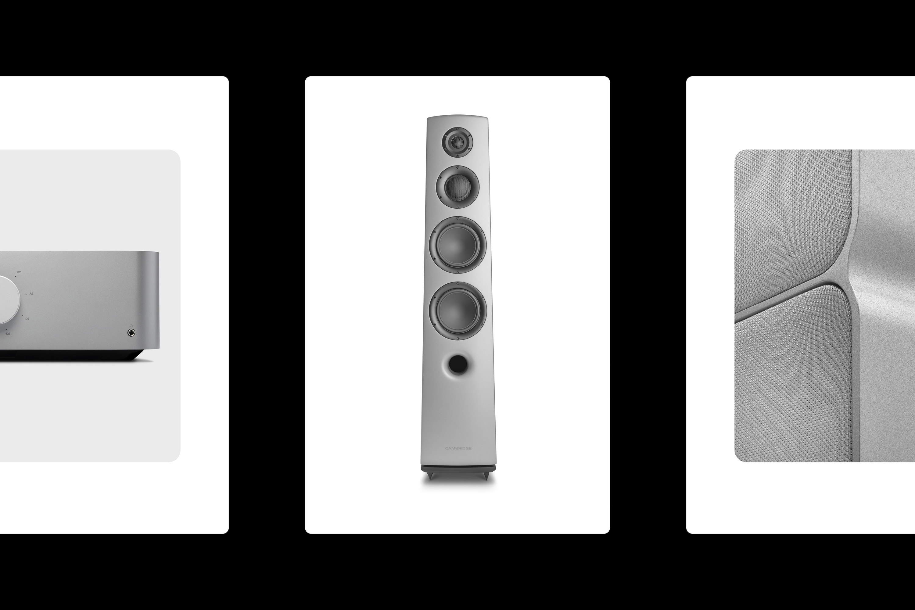
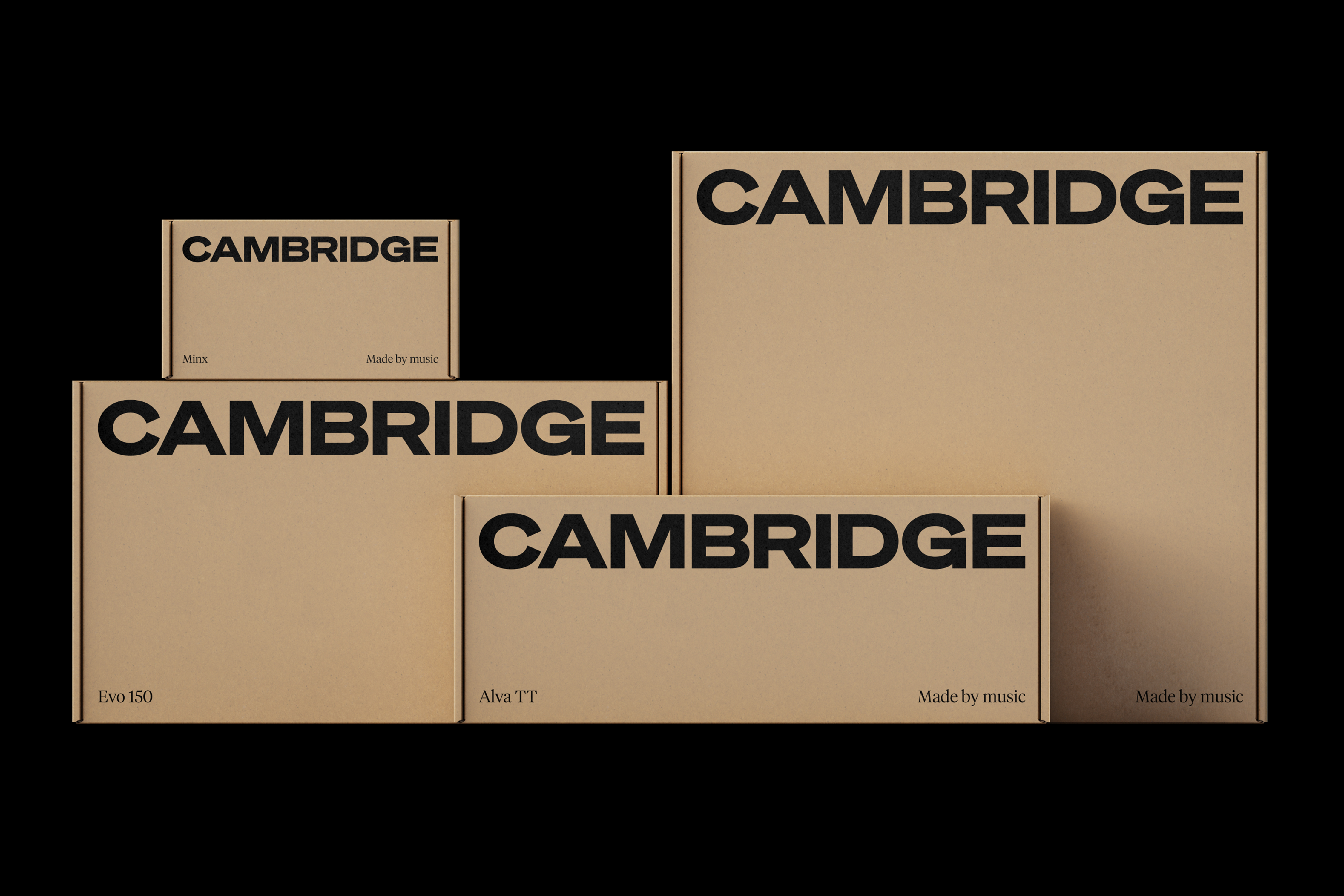
CAMBRIDGE AUDIO
︎︎︎ Motion Design
︎︎︎ Case Study
“Cambridge Audio is one of the UK’s great audio success stories. An independent British company, quietly making some of the world’s best hi-fi products since 1968.
For decades, they’ve been trusted by audiophiles, renowned for brilliant sound, obsessive engineering and quality that lasts. But while the products kept getting better, the brand hadn’t evolved at the same pace. Our role was to open it up: to help Cambridge connect with new audiences, break out of the hi-fi bubble and build long-term relevance.”
My involvement in the project was finalising the motion assets for OnlyStudio to use on their website/socials.
OnlyStudio (2025)
Project Team:
Matthew Tweddle
Daniel Tweddle
Aidan Cooke
Daniel Reed
Kyriakos Kokkinos itslynx
Photography:
Percy Dean, Joshua Halling
Videography:
blindeyefilms
3D Design:
nform.studio
Typography:
Söhne, Tiempos Headline
835453


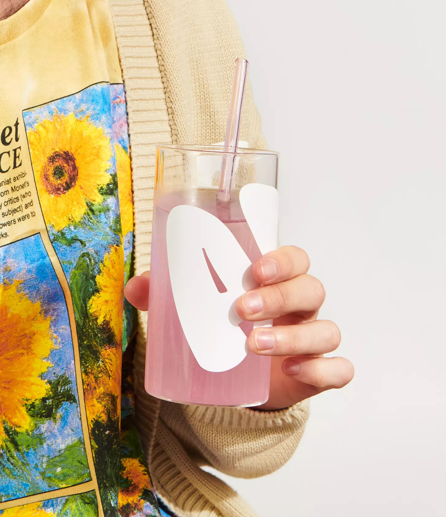
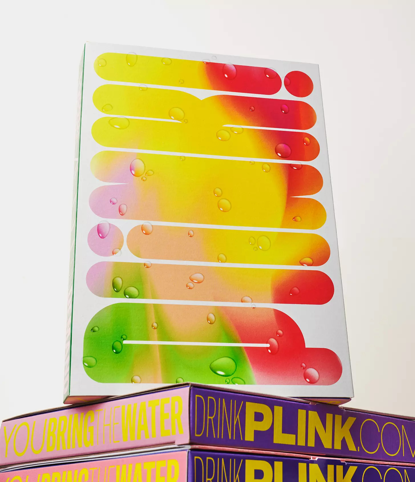
PLINK!
︎︎︎ Motion Design
︎︎︎ Case Study
“Effectively the bath bomb of the beverage world, Plink! is a naturally flavoured effervescent tablet that turns any glass of water into a refreshing drink, using just 1% of the packaging of a normal bottled or canned drink with 98% less carbon impact per serving.”
“From the name to the bold and graphically charged identity–we envisioned an energetic and exciting brand where flavour, fun and authenticity are at the forefront. The name itself is both onomatopoeia and instruction. It's the sound of the product entering the water and starting to work its magic. For us, the energy and emotion that the name Plink! evokes helped to guide the rest of the brand language, including the use of bright colours, exaggerated typography and a very human, authentic way of communicating with the world.”
My involvement in the project was creating the final brand film and various animations for PLINK! and the Made Thought case study.
Made Thought (2023)
3D Design: Laura Cooper
Photography ©PLINK!
835453386